
Creating custom KPI dashboards in HubSpot allows you to monitor business performance in real time, simplifying data analysis and improving business decisions. Here are the main steps to set up your dashboards:
- Access to custom reports: Available in HubSpot's Professional or Enterprise plans (Marketing Hub, Sales Hub, etc.).
- Data source selection: Combine data from marketing, sales, contacts, companies, and more.
- Field and chart configuration: Use dimensions and measures to represent KPIs clearly. Choose bar charts, single-value KPIs, or pivot tables.
- Filter application: Refine data with AND/OR logic and specific time filters.
- Dashboard creation and management: Organize reports with a drag-and-drop layout and update data every 2 hours or manually every 15 minutes.
For Italian SMEs, it is useful to focus on KPIs such as revenue, lead conversion rate, sales cycle duration, and customer acquisition cost. Format data with symbols (€), number separators, and local dates for clear visualization.
Well-organized dashboards help you identify problems, seize opportunities, and stay focused on business goals.

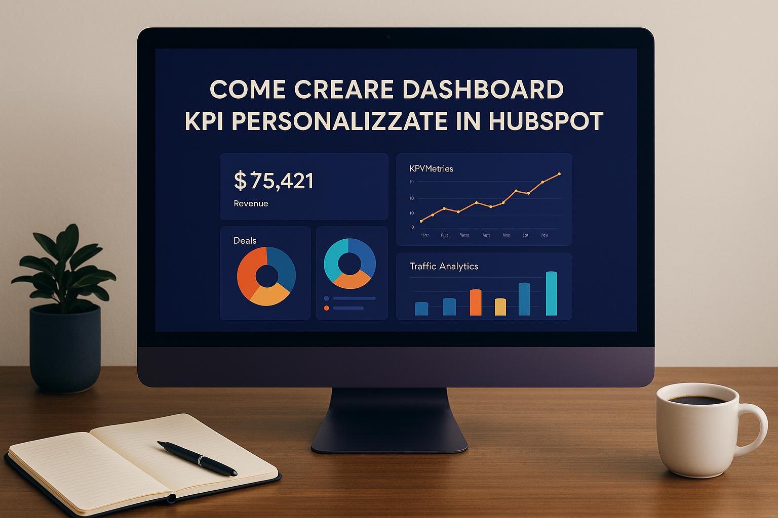
Process for creating custom KPI dashboards in HubSpot
How to Use Reports and Dashboards in HubSpot | Tutorial in Italian

How to access reports and create a custom report
To create custom reports and build your KPI dashboard, access the reports section. Here's how to configure everything step by step.
Find the Reports section
From your account's main menu, follow the path: "Reporting" > "Reports. " Once there, click on "Create Report" in the upper right corner. In the side menu, select "Custom Report" and then click "Next. " At this point, choose the "Create a custom report" option to begin configuration.
Once you have found the right section, you can move on to selecting the data sources.
Select data sources
The data sources you choose directly influence the information that the report will display. HubSpot allows you to access data related to marketing activities, sales, and various platform objects, such as contacts, companies, deals, and tickets. Combining multiple sources gives you a more comprehensive view for monitoring your business KPIs.
To begin, select a "Primary data source" from the menu. If necessary, enable the "Add more data sources" option to include additional sources. Remember that the fields available for reporting always depend on the sources you choose. For example, if you want to analyze lead conversion rates, be sure to include both contacts and deals.
You can also add event-related fields, available in the "Events" section of some data sources. Please note, however, that each custom report can include only one event field and that the data will be limited to a specific time range. When you have completed your selection, click "Next" to continue with the report configuration.
Configuring data fields, filters, and charts
Once you have selected your data sources, the next step is to configure fields, filters, and charts to represent your KPIs clearly and effectively.
Add properties and metrics
HubSpot divides data fields into two main categories: Dimensions and Measures. Dimensions, highlighted in gray, represent non-aggregated data, ideal for the X-axis or for segmenting data. Measures, on the other hand, are green and include aggregation methods, perfect for the Y-axis, and often represent numerical values, such as the number of associated transactions.
To begin, select the properties that best reflect the KPIs you want to monitor. This step is essential for creating dashboards that highlight the metrics most relevant to your business.
Choosing the right type of chart
HubSpot offers several types of charts to represent your KPIs. If you are unsure which one to choose, you can activate the "smart chart" feature: the system will automatically suggest the most suitable chart, highlighting it in light gray.
- Line or bar charts: ideal for showing trends over time, such as monthly lead generation trends.
- Single-value KPI charts: perfect for highlighting key metrics.
- Indicator charts: useful for monitoring progress toward a goal, with colored bands indicating status (yellow for good, orange for average, red for poor).
- Pivot tables: excellent for detailed analysis, they allow you to cross-reference up to four rows and four columns.
After selecting the chart, the next step is to apply filters to refine the data.
Apply filters to data
Filters are essential tools for obtaining more accurate reports focused on KPIs. To add them, go to the "Filters" tab or click on "Actions" and select "Add to filters. " You can configure the filter logic by choosing from:
- "ALL": for cumulative conditions.
- "ANY": for alternative conditions.
- Custom rules with AND/OR operators.
An important detail concerns date-based filters, such as "This month," which use the account's time zone to ensure consistency across all users. However, HubSpot's default date property values are displayed in the local time zone, which may cause slight discrepancies. In addition, the "This week" filter considers Monday as the start and Sunday as the end.
To optimize report performance, it is recommended to add specific filters or use dimensions with a small number of unique values, as non-tabular reports are limited to 1,000 rows of data.
Save reports and build your dashboard
After setting up fields, filters, and charts, the next step is to save your work and organize your reports in a centralized dashboard.
Save and name reports
To save a report, click "Save report" at the top right of the report builder. In the side panel, assign a descriptive name that makes it easy to identify the content. An example? "Leads generated by channel - Q1 2025" is much clearer and more useful than a generic "Leads report."
Then decide where to place the report: you can leave it in the general list by selecting "Do not add to dashboard, " add it to an existing dashboard using the drop-down menu, or create a new one by choosing a name and setting visibility. After clicking "Next, " define the access level, specifying who can view or edit the report. Reports added to a dashboard will automatically follow the access settings of the dashboard itself. Finally, click "Save" to complete.
Once saved, reports can be easily integrated into the dashboard.
Add reports to the dashboard
If you have already saved reports and want to add them to a dashboard, there are two ways to do this:
- Go to Reporting > Reports, place the cursor on the desired report, click on the "Actions" menu, and select "Add to dashboard. "
- Go to Reporting > Dashboard, click on "Add Content, " then on "Report. " From the side panel, locate the report and click on "+ Add. "
Please note that each dashboard has a maximum number of reports, which depends on your HubSpot subscription: Starter accounts can include up to 10 reports, while Professional and Enterprise accounts can include up to 30. Reports update automatically every two hours, but you can perform a manual update every 15 minutes to get the most recent data. Note that if a report has more than 99 values in the "Break down by" property, it will not be displayed in the dashboard and will need to be viewed directly in the reports section.
Manage the dashboard layout
After configuring your reports, it's important to organize them effectively within the dashboard. HubSpot provides a drag-and-drop system that allows you to move and resize widgets with ease.
Move and resize dashboard widgets
To rearrange reports, simply drag and drop widgets to the desired location. Select a report, drag it to your preferred spot, and create a layout that highlights the most relevant data. To change the size of a widget, hover overthe bottom-right corner of the report and drag to adjust it to your needs.
A tip: keep the dashboard simple and focus on 5-9 KPIs to avoid visual overload.
You can also enhance the dashboard by adding text notes, images, or videos. These elements can be useful for providing context or instructions to the team, especially if the dashboard is shared with colleagues who may need additional explanations about reports or metrics.
Update dashboard data
Reports are automatically updated every two hours. However, if you need more recent data, you can perform a manual update. To do this, access the "Actions" menu (the three dots) in the widget or use the option from the dashboard itself.
Choosing KPIs and formatting for Italian companies
Once the reports have been set up, the next step is to select the most appropriate KPIs and present the data in a way that reflects the Italian context.
KPIs relevant to Italian SMEs
The choice of KPIs depends on the growth stage of your company. If you are just starting out, focus on metrics such as total revenue, average deal size, and lead conversion rate. When your company is expanding, add metrics such as sales cycle length, pipeline velocity, and customer acquisition cost (CAC). Other useful KPIs include customer lifetime value (CLV), churn rate, percentage of repeat customers, cost per lead (CPL), landing page conversion rate, and email campaign performance.
It is important to evaluate each KPI for its impact on business decisions. If a significant change in a KPI does not affect strategic decisions, it is probably not necessary to include it in the dashboard.
Now let's see how to adapt the formats to comply with Italian standards.
Adapting formats to the Italian reality
For an effective dashboard, it is essential to use formats that follow Italian conventions. You can do this by editing the fields in the reports: set the number of decimal places, thousand separators, currency format with the € symbol, or percentages. The regional settings in your HubSpot account automatically manage the currency symbol and number separators. Dates are also displayed consistently based on the user's local time zone, ensuring uniformity in time data.
With a properly formatted report, it's time to see how Axenda can improve your strategy with dashboards.
How Axenda supports HubSpot dashboards

Axenda creates customized KPI dashboards for Italian SMEs, integrating tools such as CRM, automation, and training to facilitate strategic decisions. As a HubSpot Provider & Consultant, it handles the entire process: from complete CRM implementation to advanced automation configuration, to the creation of operational dashboards that combine sales, marketing, and customer service processes.
Conclusion
Creating custom KPI dashboards in HubSpot means transforming raw data into strategic tools, offering Italian SMEs concrete support to make more informed decisions.
Once the reports have been configured, their true value lies in their ability to provide both a general overview and specific details. This allows you to analyze overall sales, but also to evaluate the performance of individual sales representatives or specific product lines. Such a layered view helps you recognize trends, address any critical issues, and seize opportunities in real time.
For Italian companies, paying attention to local details, such as using the € symbol and the correct number separators, is essential. This makes data easier to read, reduces the risk of errors, and makes information more accessible.
The most effective dashboards aren't static: they grow with your business. You can adapt them by segmenting KPIs by team or geographic area, adding new metrics such as customer retention rates, or integrating data from other platforms.HubSpot's automation also ensures that data is always up to date, eliminating the risk of manual errors and keeping information ready for quick, targeted decisions.
With a well-designed and properly formatted dashboard, you don't just monitor performance: you have a tool that effectively guides your company's daily strategic decisions.
Frequently Asked Questions
What are the benefits of custom KPI dashboards in HubSpot?
HubSpot's custom KPI dashboards are a valuable tool for managing business activities. They allow you to keep track of key metrics, providing a clear and immediate overview of marketing and sales performance, all in one place.
With real-time updates and the ability to customize reports based on specific business needs, these dashboards make it easier to make quick and informed strategic decisions. They also promote greater collaboration between teams, ensuring that everyone has access to up-to-date and relevant data.
Which KPIs should I choose to support my company's growth?
To choose the KPIs best suited to your company's growth, it is essential to identify the metrics that best reflect your strategic objectives. Some examples may include revenue, conversion rate, sales cycle, or average value per customer. The idea is to focus on indicators that represent current priorities, bearing in mind that these may change over time.
Adapt KPIs to your company's maturity level and ensure you use clear, well-organized dashboards to monitor results. This approach allows you to make more informed decisions and stay focused on your main objectives.
What are the best charts for analyzing sales data?
To represent sales data clearly and effectively, it is important to choose the right type of chart for the message you want to convey. Bar and line charts work well for highlighting trends and comparisons over time. If you want to show proportions between different categories, pie charts are an intuitive choice. To compare multiple variables at once, radar charts offer a comprehensive view. Finally, heatmaps are ideal for identifying patterns and points of interest in more complex datasets.
The key is to choose a chart that makes the data easy to understand and that suits your audience and the objectives of your analysis.
Related blog articles

Akram Hussein
Senior Software Engineer and RevOps Consultant, Co-founder of Axenda. Helps B2B companies design and implement structured HubSpot systems that align marketing, sales, and operations — turning operational chaos into clear, scalable, and predictable revenue processes.